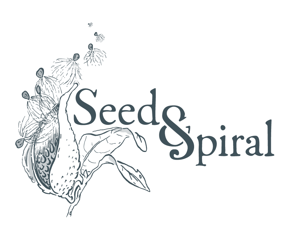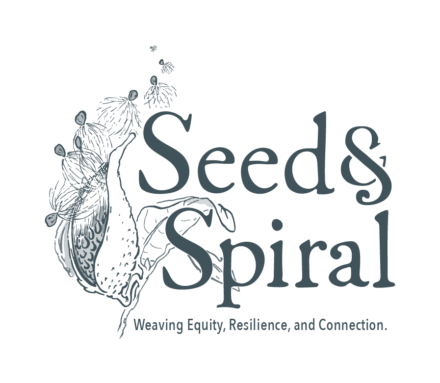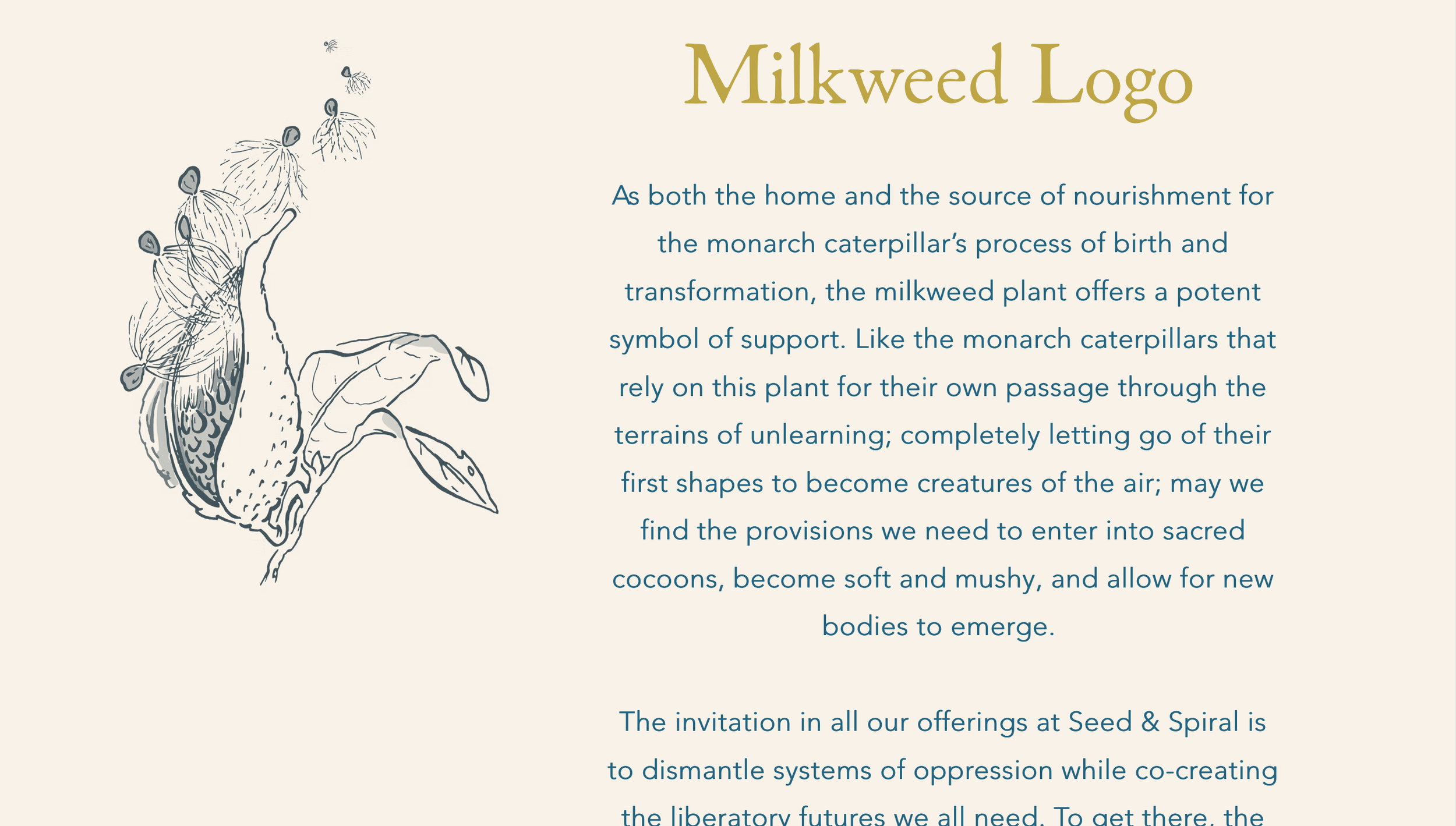
Seed & Spiral
I developed this logo for Kara Bender, who works in collaboration with many others to teach racial equity workshops for white folks in employment and community group settings. She requested an illustration of a milkweed pod as her work is about learning from nature about the process of transformation and planting seeds of change. She works with various artists to create botanical and natural illustrations for her website and workshop materials, and so a challenge of this project was creating a logo that could consistently represent the brand, while also working well within systems featuring other artists’ work.
The owner wanted a hand-drawn feel to the type, so we chose a typeface with those qualities, and I modified a popular ampersand from the Abril Fatface family, which could function as both an ampersand and the “S” in Spiral in the primary logo lockup. The client requested a vertical stack as well, where it seemed to make more sense to add the S back in. The floating seed elements can be applied together or separately.