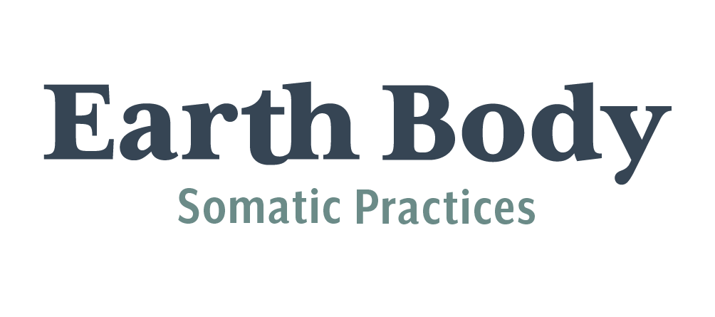
Earth Body
I developed this logo for Rachel Tate, a body work practitioner in St. Louis who uses various modalities from massage to Somatic Experiencing to Movement Coaching. They wanted a logo that felt earthy and utilized the image of the pine cone as a metaphor for how our bodies can energetically open and close to support and protect our needs in different conditions. Rachel was excited for me to utilize my ability to work in letterpress and physical media to create elements of their logo.
For this logo I sketched and then created a wood block of a pine cone. After physically printing the block and the moon as primary elements of the image, I scanned the prints and took them into Illustrator to create vectors. I chose Mrs. Eaves for the primary font, and created a subtle ligature connecting the curves of the “t” and the “h” to reference the connection to nature and each other that the owner prioritizes.
This is another example of an owner that uses the logo elements in different ways, and I was happy to create a system of logo assets that they can apply in various contexts and in various combinations. On a personal note, I can attest to the beauty and efficacy of Rachel’s body oils and salves, which you can purchase here.